Tiny Paws
This project is a web platform design for Tiny Paws, a cat rescue and adoption organization committed to feline welfare. It supports adoption, fostering, volunteering, and donations, while providing educational cat care resources.
"Tiny Paws connects caring humans with cats in need, building lasting bonds through rescue and adoption."
Project roles
Motion and UI/UX Designer
Timeline
3 Months
Software
Figma, Photoshop, and After Effects
Skills
User Research, Persona Development, Competitor Analysis, Visual Design Principles, Wireframing and Prototyping, Usability Testing, and Motion Graphic Design.
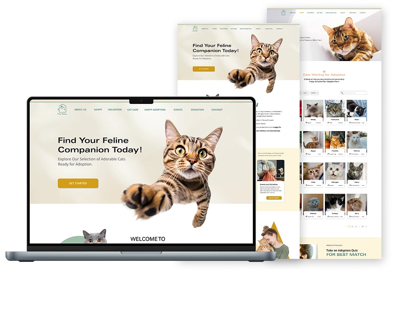
Website Prototype Preview
Project Objectives
Target Audiences
- Trustworthy families and singles seek adoption opportunities.
- Supportive foster families offer temporary care for cats.
Branding
- Playful, yet trustworthy.
- Familiar, warm, and approachable.
- Highlight cat adoption and emotional connection.
Color Palette
- Avoid blues and black backgrounds.
- Various colours, consider a color palette based on cat fur tones.
Requirements
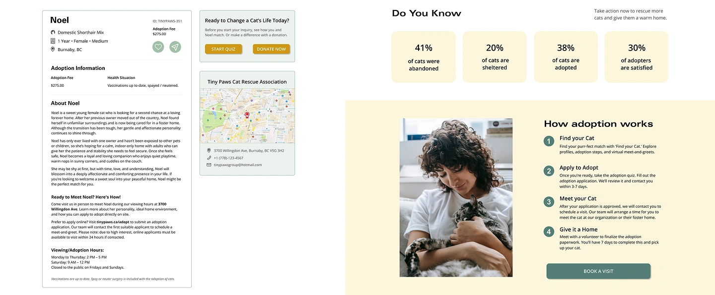
- Build trust through "About" and "Volunteer" pages, with a focus on adoption.
- Highlight cat care and share happy tail stories to promote successful adoptions.
Research & Analysis
User Interview
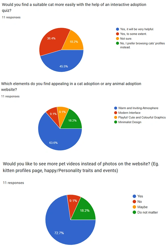
My Team conducted interviews with 12 participants, with an even split between male and female respondents. To reflect different needs, we included people from various age groups. Most participants (72.7%) were between 20 and 40 years old.
Based on our survey results, our team identified 5 key focus areas for the website, including:
- Use pet videos and a warm, inviting design to build emotional connections with users.
- Include an adoption quiz to help users find cats that match their needs and lifestyle.
- Offer optional webinars and events for those interested in learning more about cat care.
- Provide thorough descriptions of each cat to help users make informed adoption decisions.
- Encourage donations by showing empathy, sharing real financial needs, and updating how funds support the cats.
Competitor Research
We analyzed four pet rescue websites, with a focus on Petfinder and VOKRA, from a UI/UX perspective. These two platforms demonstrate strong practices in user-centered design.
Strengths
- Streamlined adoption flows improve ease of use.
- Transparent and consistent messaging builds user trust.
- Accessible educational content guides and informs users.
- Emotional, warm and inviting design enhances user engagement.
Weaknesses
- Inconsistent content updates can disrupt user trust.
- Overly complex or unclear adoption steps hinder navigation.
- Limited educational resources may leave users uncertain.
- Navigation can be unclear due to deep page hierarchies.
Our Advantages
- Design a simpler, clearer adoption journey.
- Simplify navigation with better information architecture.
- Expand and organize educational content for better accessibility.
- Introduce emotional elements like happy cat stories or testimonials.
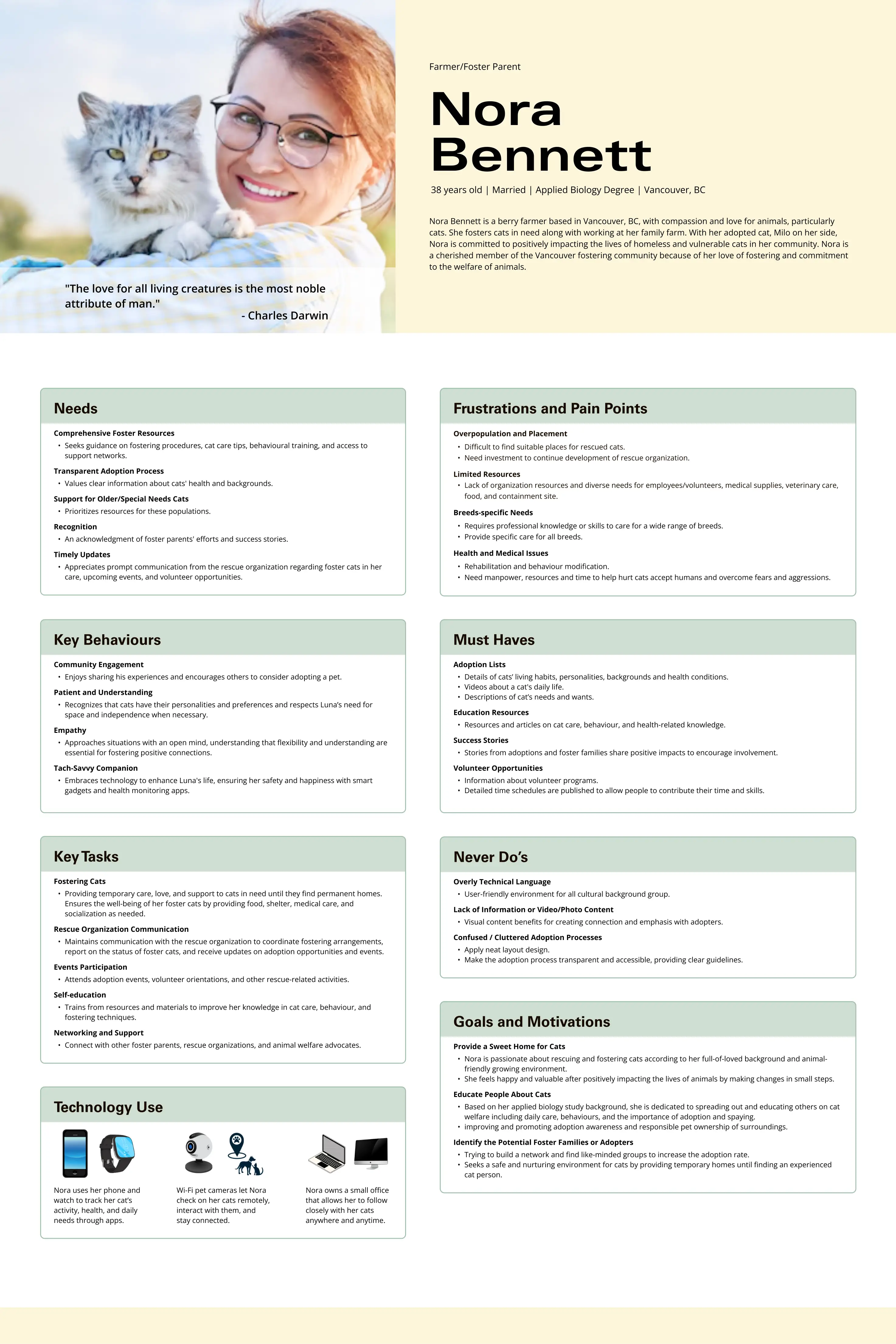
User Persona
Our website aims to find suitable adopters and ensure a good life for cats.
Foster homes are the primary persona, as they offer long-term care, expertise, and resources for the cats' well-being. The secondary user is a young adopter seeking a permanent companion and a loving home.
Design Process
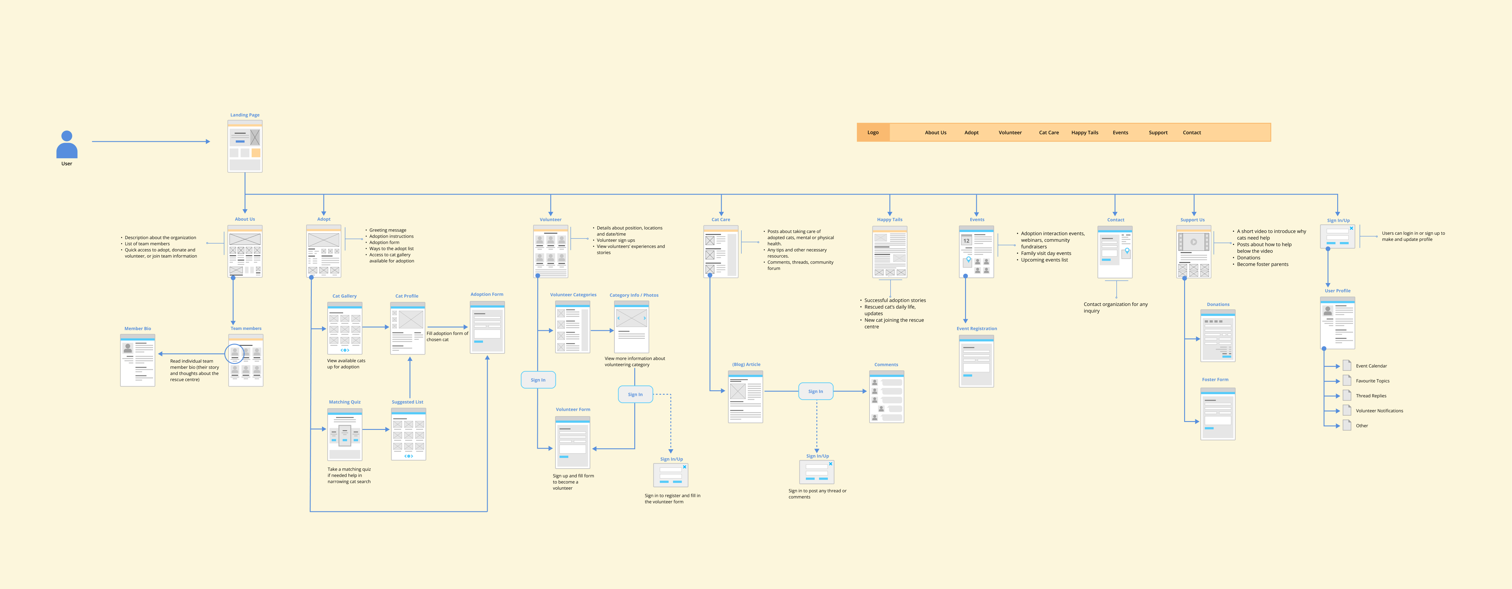
Site Map Diagram
Branding
Logo Design
Colors
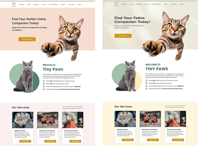
The colors combine warm tones inspired by cat fur, with yellow hues representing the warmth and vitality of a cat's coat. The light pink tones add a cozy, inviting feel, while the green tones provide balance and a natural touch, enhancing the overall warmth and comfort.
#537F78
#A0C0A9
#F7DDCF
#CF9713
#FCF6DB
#FBF1EE
Typography
Univers LT Std is used for headings because of its clean, modern, and versatile look, while Open Sans provides excellent readability and clarity for body text..

Wireframes
Usability Test
01. Visual & Typography Refinements
- Users felt the heavy use of pink was overwhelming and not visually appealing to all.
- Text lacked clear hierarchy due to low contrast between headings and body text.
Improvements made:
- Introduced a secondary typeface to improve clarity and emphasis.
- Enhanced text hierarchy through better color contrast and capitalization.
- Replaced pink with light yellow tones inspired by cat fur for a softer look.
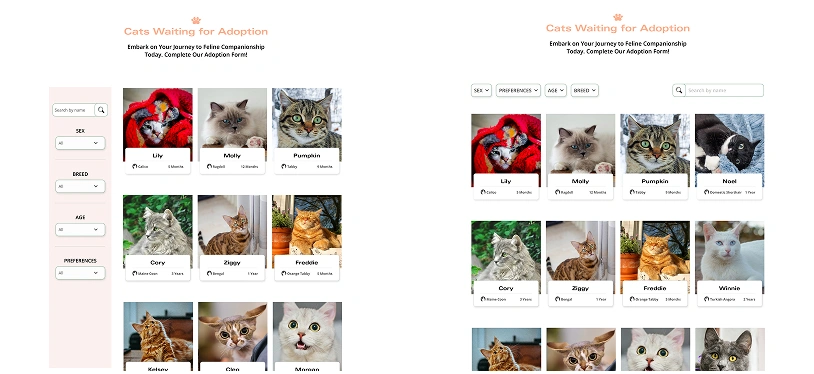
02. Optimized Layout for Better Display Space
- Users noted that the left-side filter panel took up too much screen space.
- This layout limited the number of cats visible at one time.
Improvements made:
- Relocating filters to the top improves accessibility and creates a cleaner layout.
- The new design displays more cats per screen, enhancing browsing efficiency.
03. Adoption-Centered Improvements
- Increased focus on adoption by providing more cat information.
- Moved the detailed adoption process to the home page for better visibility.