Equity First HR
This case study showcases the redesign of the website and branding for Equity First HR, a Canadian EDI consulting firm. The goal was to create a modern brand image, focusing on human-centered design and EDI values. The new website features an easy-to-navigate layout, increased trustworthiness, and a clear visual hierarchy.
"Equity First HR redefines human resources through equity to build inclusive, thriving workplaces."
Project roles
Graphic and UI/UX Designer
Timeline
8 Weeks (2025)
Software
Figma, Adobe Photoshop, and Illustrator
Skills
UI/UX Web Design, covering Branding, Logo Design, Market Research, Competitor Analysis, Visual Design, Wireframing, Prototyping, Usability Testing, and the design of Infographics and a White Paper Booklet.
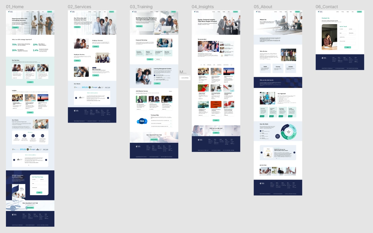
Prototype Preview
Client Needs
This was a two-person collaborative project, conducted entirely remotely with all meetings and presentations held online. In the first week, I analyzed the client's needs to gain a better understanding of their expectations and goals.
Target Audiences
- Businesses and nonprofits building equitable, inclusive workplaces.
- Public sector teams reviewing policies through an equity lens.
- Organizations fostering genuine inclusion and improving employee engagement.
Branding Requirements
- Focused on a human-centered, inclusive, and accessible branding approach to support the company’s transition to a modern digital platform.
- Ensured visual consistency by curating and unifying imagery across the website.
Color Palette
- Avoided pink tones based on palette constraints.
- Chosen color palette of green and blue to reinforce a professional and trustworthy brand identity.
Research & Analysis
Competitor Research
After researching several direct and indirect competitors, four primary direct competitors were chosen for in-depth analysis: Bain & Company, CultureAlly, Korn Ferry, and Empower EDI. The analysis focused on their target audience, brand identity, and the strengths and weaknesses of their UI and UX.
Strengths
- Consistent branding with cohesive colors, typography, and graphics.
- Effective UI design with clear navigation, CTAs, and organized content.
- High readability with large headings, short paragraphs, and proper alignment.
- Trust and professionalism established through case studies, partner logos, and testimonials.
Weaknesses
- Confusing navigation with unclear labels and disorganized menus.
- Inconsistent button styles with excessive variations and poor color contrast can confuse users.
- Font sizes that are too small and an overuse of colors can hinder readability and create visual clutter.
- Overloaded layouts with dense content make it hard for users to focus and absorb information.
Current Site Review
Based on market and competitor research, an initial evaluation of the website reveals three key pain points that require improvement.
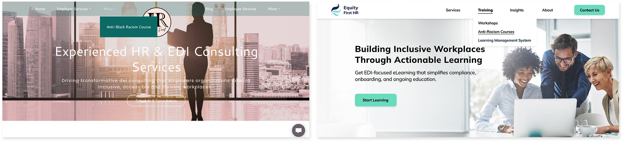
Pain 1 – Unclear Navigation –
- The navigation bar uses unclear and ineffective language, making it difficult to quickly access key services.
- Some navigation items are not fully visible, lacking a clear hierarchy.
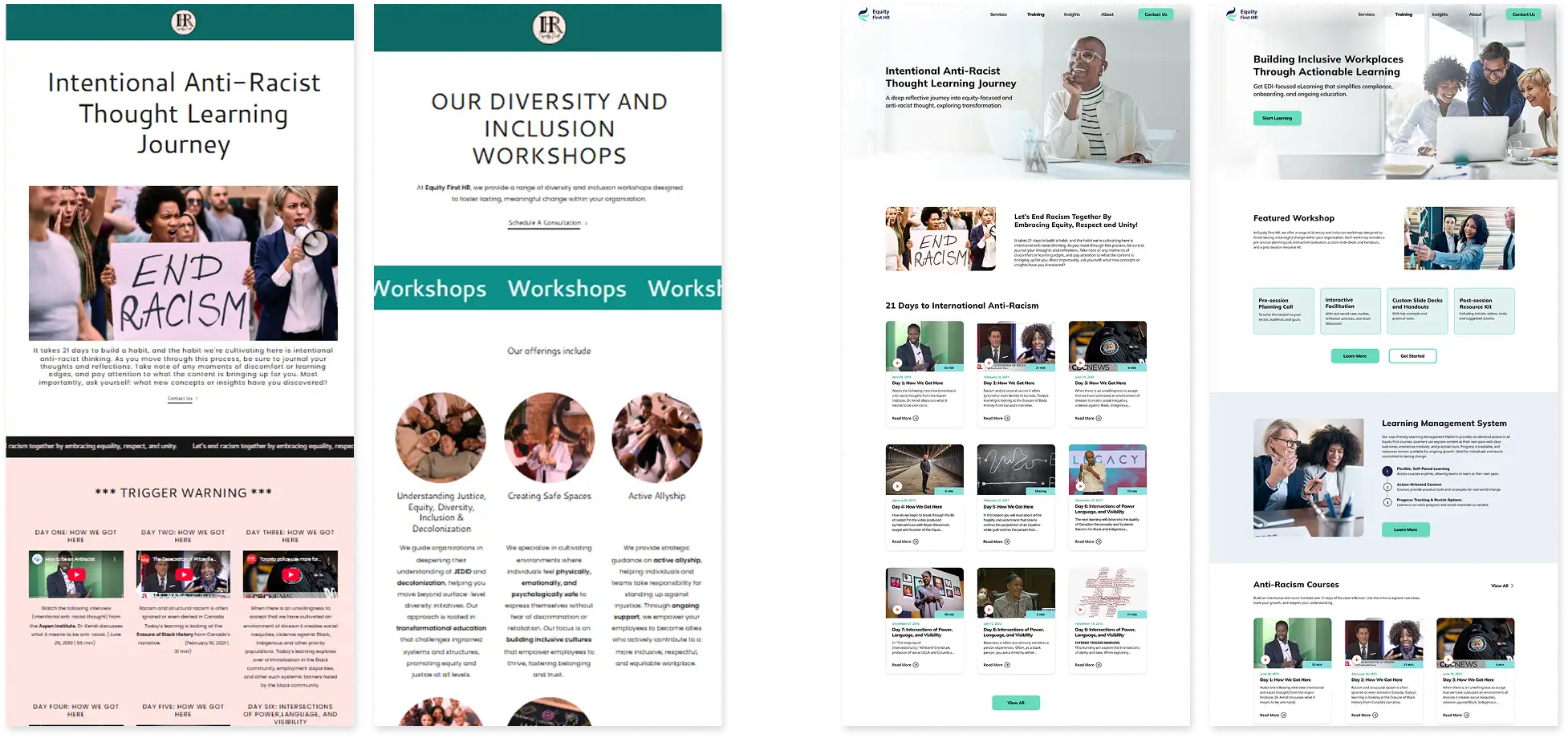
Pain 2 – Lack of Visual Hierarchy –
- The content hierarchy is unclear, with no distinct font styles to differentiate sections.
- The paragraphs are too dense and not concise enough, which reduces readability.
Pain 3 – Poor Accessibility –
- The site does not meet WCAG AA standards, limiting accessibility for users with disabilities.
- The site does not clearly communicate its strengths or brand identity.
The main focus moving forward is to redesign navigation with clear labels and structure. The content will use a clean layout and typography with consistent spacing and logical content flow, while improving accessibility and clarifying brand identity.
Design Process
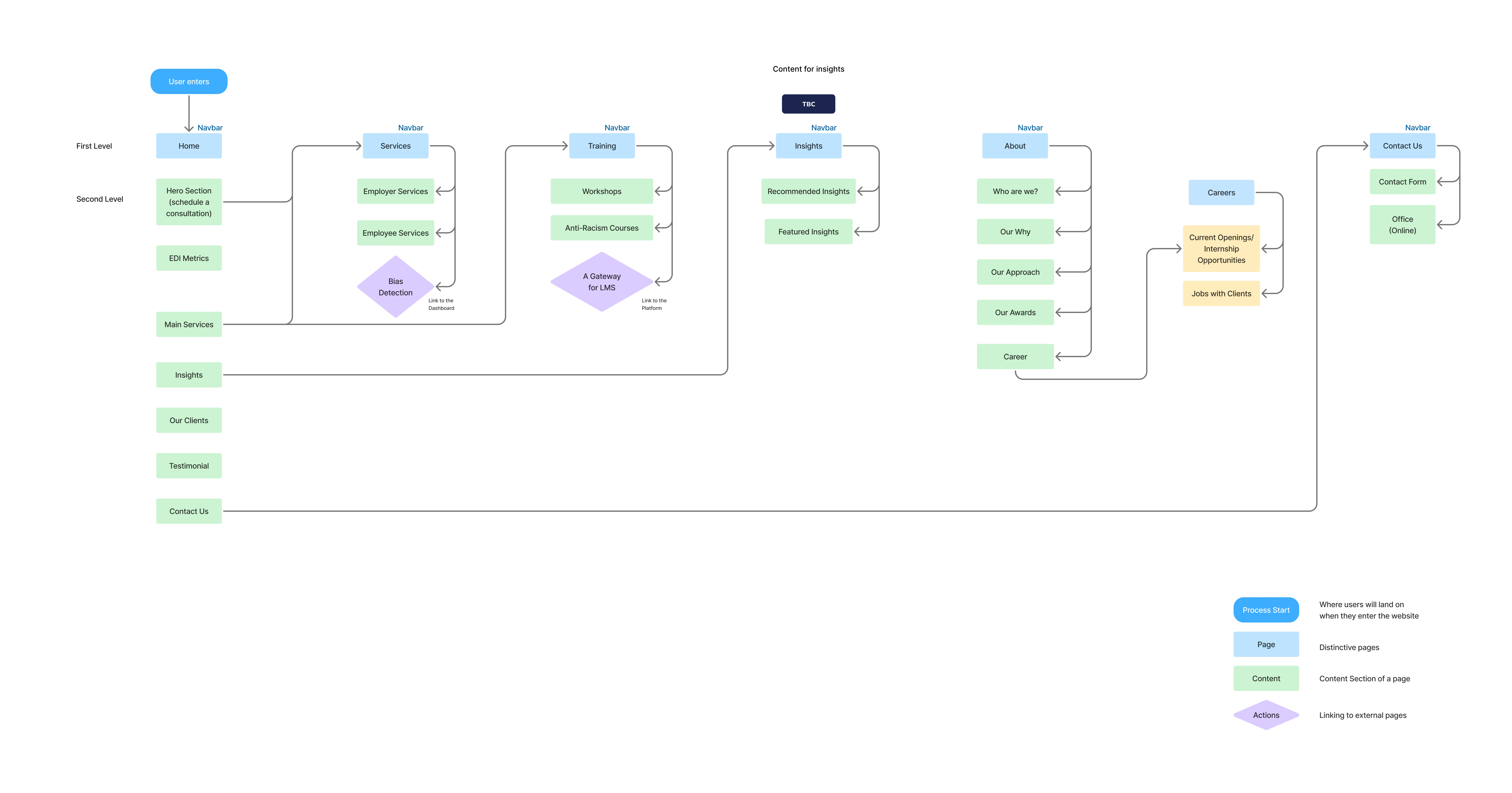
Site Map Diagram
Branding
Logo Design
Equity First HR's logo uses inward-wrapping feathers to symbolize freedom, unity, and acceptance. The three colors represent equity, diversity, and inclusion. Together, they form a clear and welcoming visual identity.
Colors
The primary colors are navy blue and minty green, with the other colors serving as accents. The palette conveys a professional, clean feel. Different colors are assigned to various features to aid in recognition. For example, services will use light green, and training will use grey-blue.
#1B254D
#8BDFE1
#EAF0F6
#139D7B
#6ADBBF
#E1F1F1
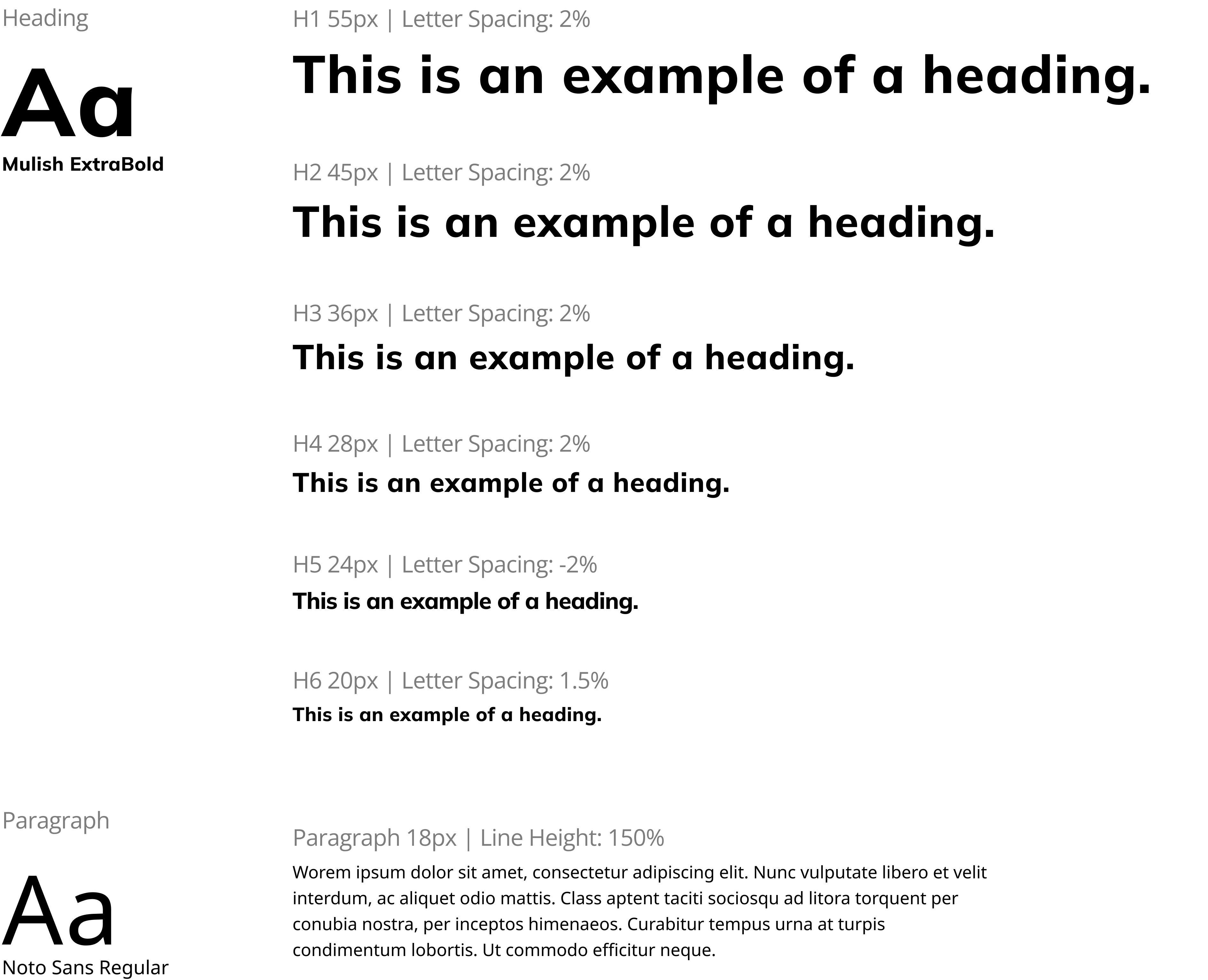
Typography
Mulish is used for headings because of its clean, modern look and rich variety of styles, while Noto Sans is selected for body text because of its readability and clarity in various text sizes and contexts.
Initial Website Sketches
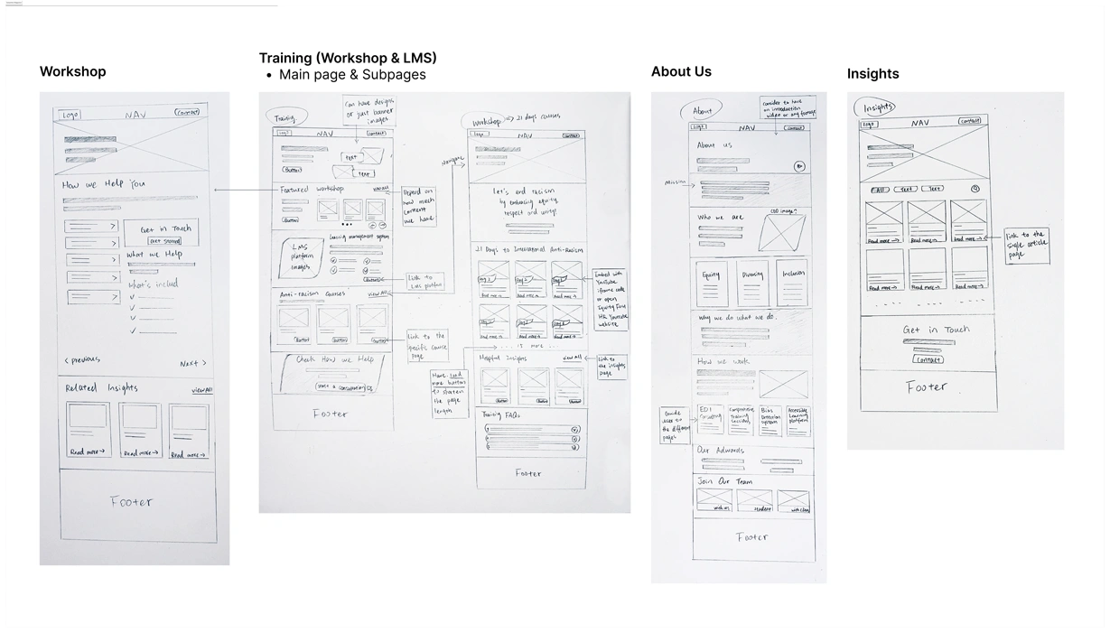
Wireframes
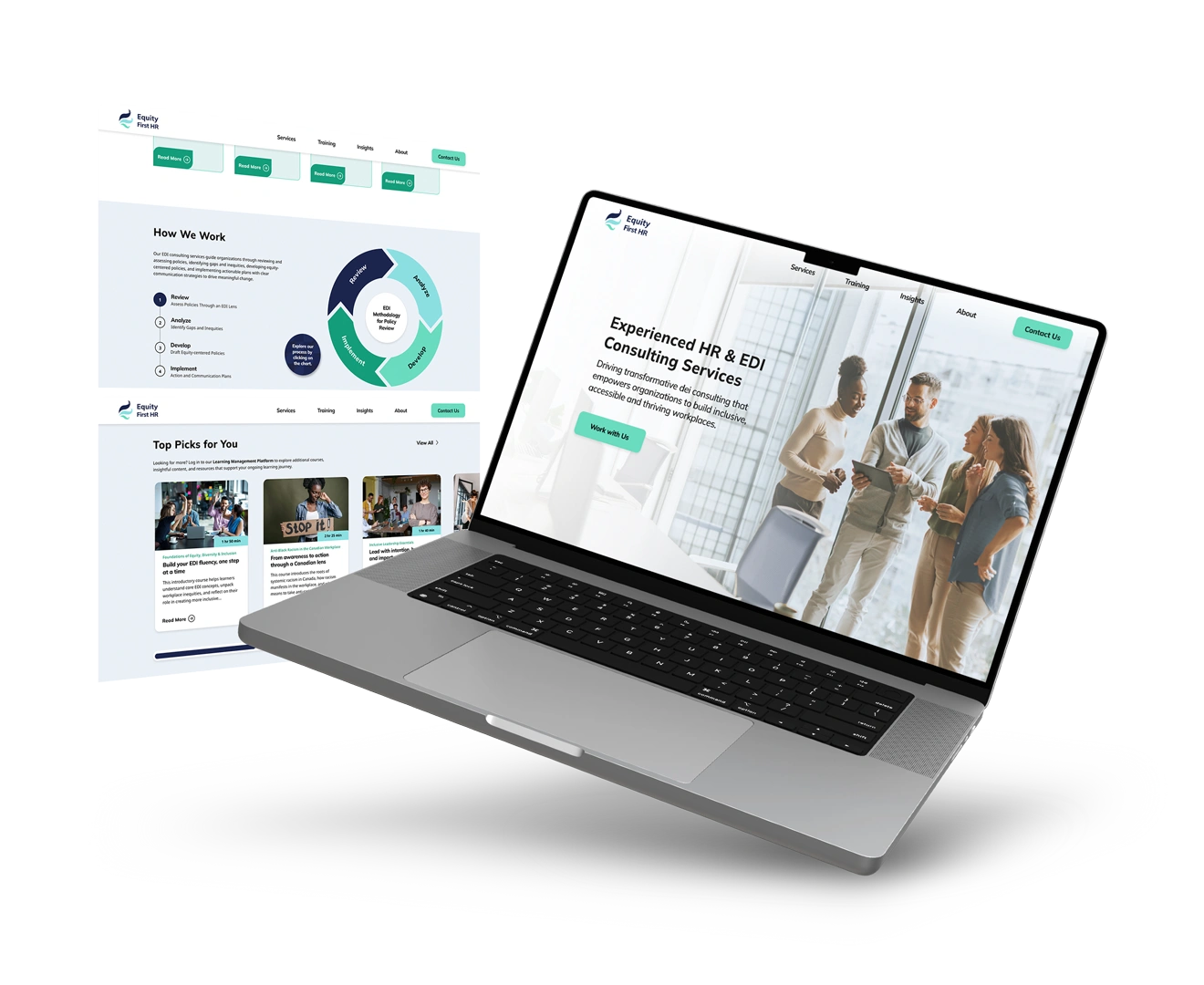
Final Results
01. Navigation and Banner Redesign
- Label the names of each target page clearly.
- Ensure compliance with WCAG standards to achieve accessibility.
- Make sure the banner covers the viewport across all devices.
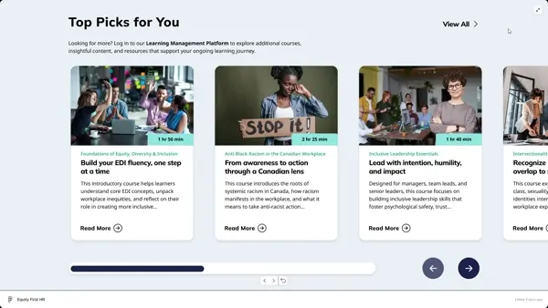
02. Streamlined Page Layout
- Redesign webpage layout to align with natural reading flow.
- Ensure good contrast between course cards and background.
- Create a main page that organizes different information into subpages to avoid information overload.
03. Build Brand Identity
- Add interactive elements to engage users and reinforce brand identity.
- Hide excessive text and reveal more details by hovering over course cards.
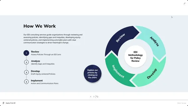
- Include interactive infographics to help users understand the full workflow.
- Add partners, testimonials, and data insights to the Home and About Us pages to build trust and credibility.

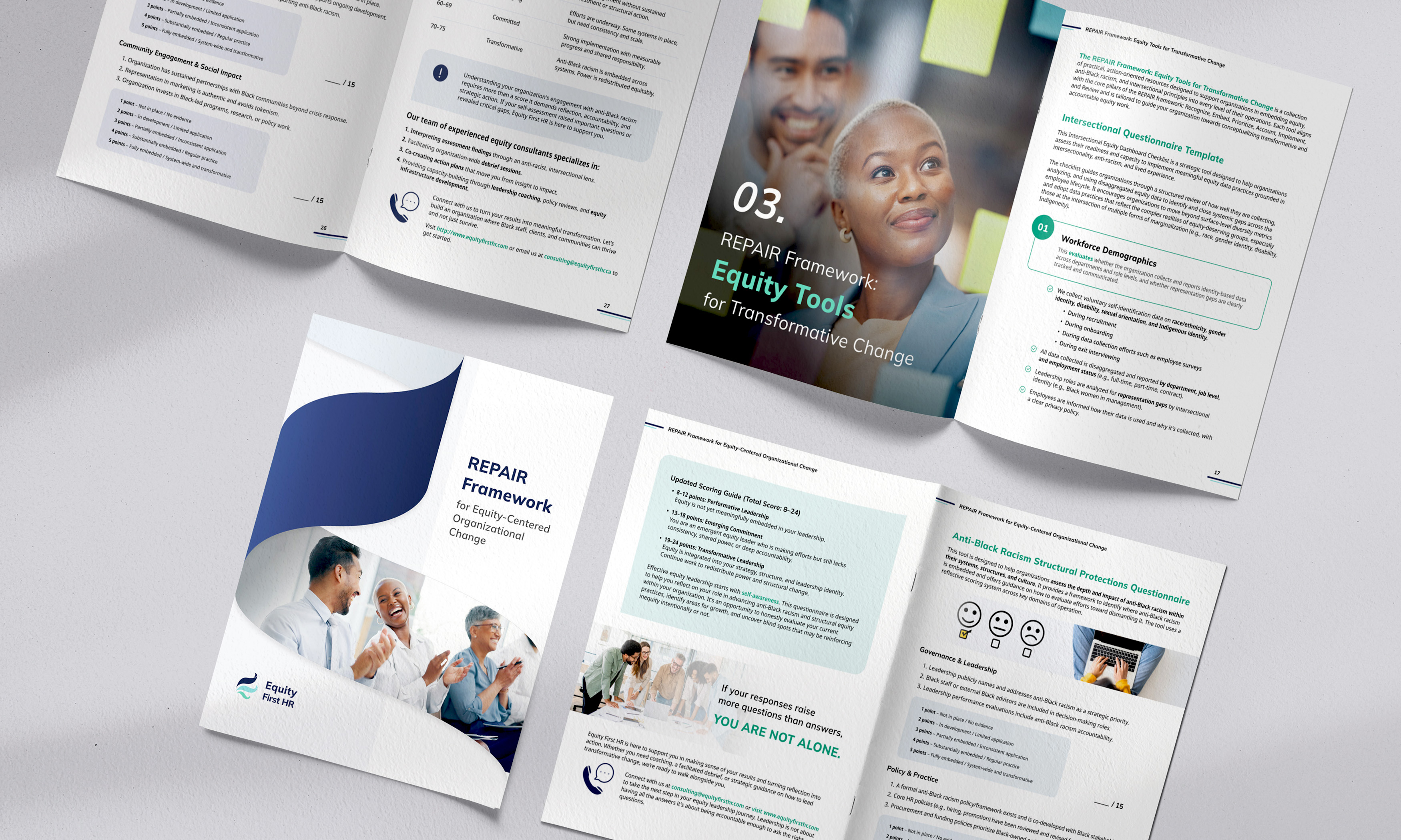
Promotional Booklet